
Design
Coherence from the cover to the line
From the cover to the page layout, every element of the design should carry the spirit of your book. With a design process that joins readability, aesthetic balance and coherence with the content, we see to it that your book does not merely catch the eye but serves its purpose.
Design is a book's first touch with its readers, and we strengthen that touch with meaning.
We aim for designs that do not only please the eye but carry the spirit of the work and form one whole with its content. Cover, type area, typography, illustration and fitness for digital formats are developed together with the tone of the telling, the readership and the purpose of the publication.
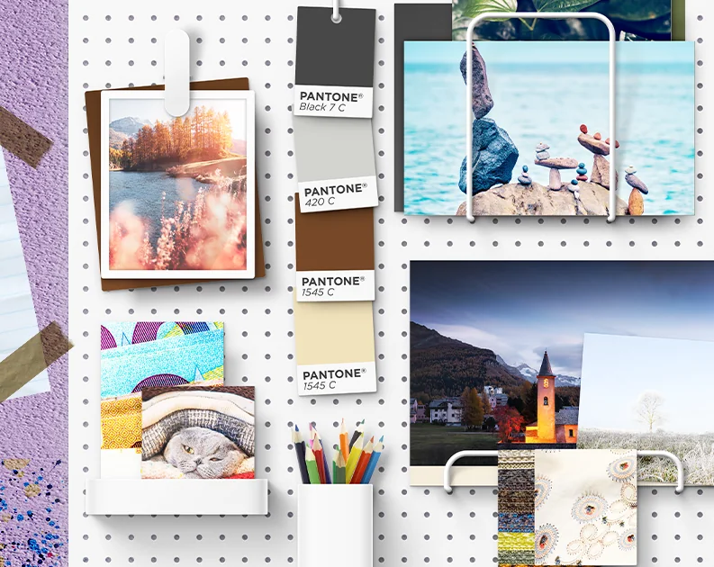
Every book carries an atmosphere of its own. We work to make that atmosphere visible through colour, white space, type and visual balance. With page layouts that put readability first, that do not distract and are yet shaped by a considered aesthetic, and with illustration that strengthens the meaning, we support the content of the book.
With an understanding of design that serves print and digital formats alike, we see to it that your book stands visible, telling and coherent on the shelf as well as on the screen.

- A cover with effect
- Page design
- Typography in the rhythm of the text
- Illustrative support
- Design for print and screen
Frequently asked
What people often ask
Are there several cover designs to choose from?
Depending on the work we present a main design; where it helps, alternatives are looked at as well.
What matters in the inside design?
Readability, type that suits the text, balanced white space and fitness for print.
Will the design be agreed with me?
No step moves on without your approval. Where it is needed there is a right to revisions.